Designing for User Experience in Mobile App Development

Mobile industries universally are witnessing an overwhelming response from mobile users. Businesses are synchronizing their e-commerce stores to fit the mobile screen. Any sub-optimal mobile UX design will hurt user engagement, and eventually, businesses will face unfavorable results.
According to Andrew Chen “the average app loses 77% of its DAUs within the first 3 days after the install.”
To prevent or decrease the count of lost daily active mobile users, let us learn the rudiments of designing a user-friendly mobile application.
What is mobile UX design?
Mobile UX design:
UX stands for User Experience, the goal of UX design is to provide users with a pleasant user experience. Even the best mobile apps fail when they are unable to give their users a memorable journey. So, UX acts as a benefactor for converting first-time users into lifetime customers. Their role encompasses customer retention and revenue turnover.
What are the deliverables of UX mobile app design development?
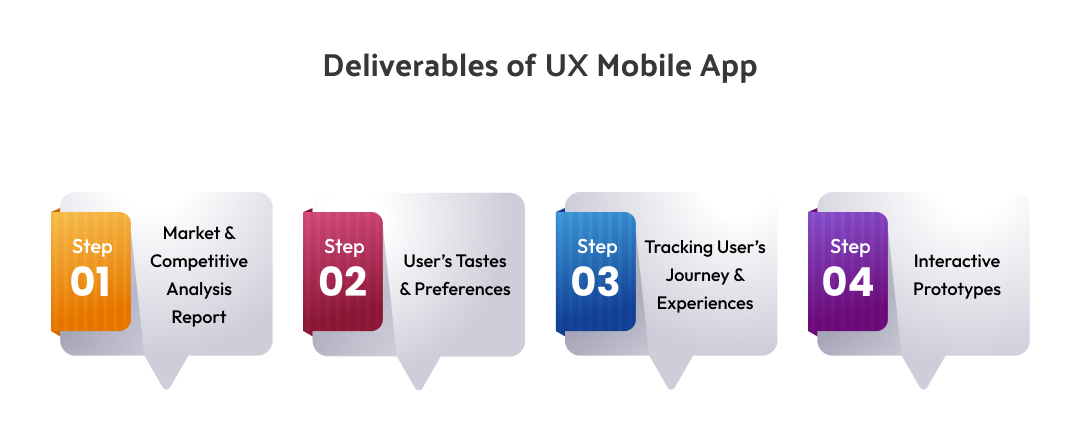
The work of any UI/UX designer goes through various phases, starting with the design process and creating deliverables for the clients. Both UI and UX have separate deliverables. Let us dig deeper to understand UX’s role better in mobile app design.
UX deliverables
Market and competitive analysis report:
This report is mainly generated to measure the competitive forces in the market for your mobile application. The efforts will become a waste of time and money if they are pitted against a highly competitive market or if the app is ill-equipped to meet the market forces. Through this analysis, the strengths and weaknesses of the competitor as well as our app opportunities and threats are found.
Users’ tastes and preferences
The designer needs to understand the scope of what types of customers are targeted by the mobile apps. The app cannot be created unless a thorough understanding of buyers’ tastes and preferences is obtained and researched. The UX process involves communication with the preferred audiences through our apps.
Tracking users’ journeys and experiences:
Users’ journeys show the various steps a user takes during a product purchase. Their interaction at various stages includes the current purchasing pattern as well as future saved choices.
Users’ experiences are like a dashboard displaying their emotional behavior towards the product. It can range from time spent on the product to thoughts, expectations, reviews, and ratings.
Interactive prototypes
Creating a basic prototype saves time & effort, and with an interactive feature, it demonstrates clearly how the actual product will function after its development. Any inclusion or exclusion of the app features is possible during this stage. The designer can convey their ideas clearly to the client.
What are the key components to know when designing mobile applications?
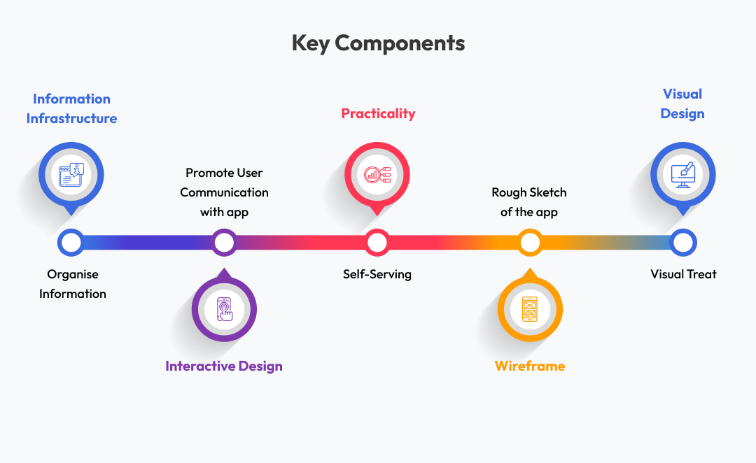
These are a few key components to be considered when you design mobile apps UI/UX.
Information infrastructure:
Information infrastructure helps organize information in digital products. The orderly layout of the mobile app helps users find the needed information without difficulty. The seamless flow helps users navigate between screens effortlessly. The UX architects determine the right infrastructure and flow.
Interactive design:
An interactive design is used to maintain user interaction with mobile apps. Some of its key elements are aesthetics, icons, colors, fonts, and images.
Practicality:
The principle behind this is to find out whether users get the information they seek through the use of the application. Further, the apps provide them with a self-serving manner to handle issues.
Wireframe:
This is part of the UI design for mobile applications, where a rough sketch is created by the designer incorporating all the features. It helps to understand the utility, functions, features, and look of the app before it enters the online market like the Play Store.
Visual design
It is an optical illusion that the mobile app brand presents before the users’ eyes. Along with choosing the best colors and fonts, it has to provide a visual treat to the users.
What is the importance of Mobile App UI/UX Design?
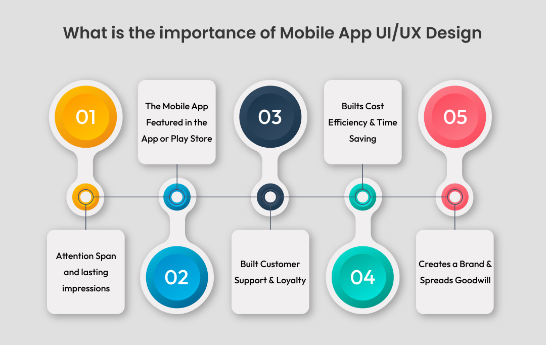
Since we know the main components of UX design, we need to understand the importance of mobile app UI/UX design from the user standpoint of view.
Maintaining equilibrium between the functionality and UI/UX design of a mobile application is crucial. Designers and developers who fail to focus on design will be at a loss even after developing a wonderful app.
Let us know about the advantages of UX design from the pointers below.
Attention span and lasting impressions:
Users today have a plethora of choices, and good UX design grabs their attention. However, to retain the information for an extended period, users must understand the designs and be able to navigate easily.
Especially for SMBs and start-ups, the design needs to create a good and lasting impression. Good app usage time depends on the quality of the product and the eye-catching UX design.
The mobile app featured in the App or Play store:
Any mobile app that wishes to be featured in the App or Play store must be rated and reviewed by happy users. When the UX design gets good reviews, without much effort, it will get featured and automatically bring more traction to your app.
Built customer support and loyalty
An attractive mobile app UX design initially draws the attention of the users. Without much marketing strategy, word of mouth is sufficient to get good reviews. Furthermore, when the app is useful to the user, a loyal customer base is built without much fanfare.
Built cost efficiency and time saving
The time and money spent on maintenance and updates will remain minimal if the mobile app UI/UX designer adheres to strict process guidelines.
Therefore, even the challenges you face after launching the app remain low.
Creates a brand and spreads goodwill:
Building an image for the product begins with the UI/UX design. A good design is recognized by the user instantly. Once they derive satisfaction from the product, their user experience helps them promote it. Credibility is built for your business based on your brand’s image and goodwill.
What Are the Differences Between Desktop and Mobile App UX Design?
With knowledge built on the significance of mobile app UX design, let us gather information regarding the differences between Desktop and Mobile App UX design.
Owning a laptop is still considered a luxury item, whereas owning a smartphone is a necessity. You can access the website if you own a smart mobile device that fits your budget and have a data package. The trend is shifting in favor of mobile phones, and the Google algorithm is formatted to penalize websites that are incompatible with mobile devices.
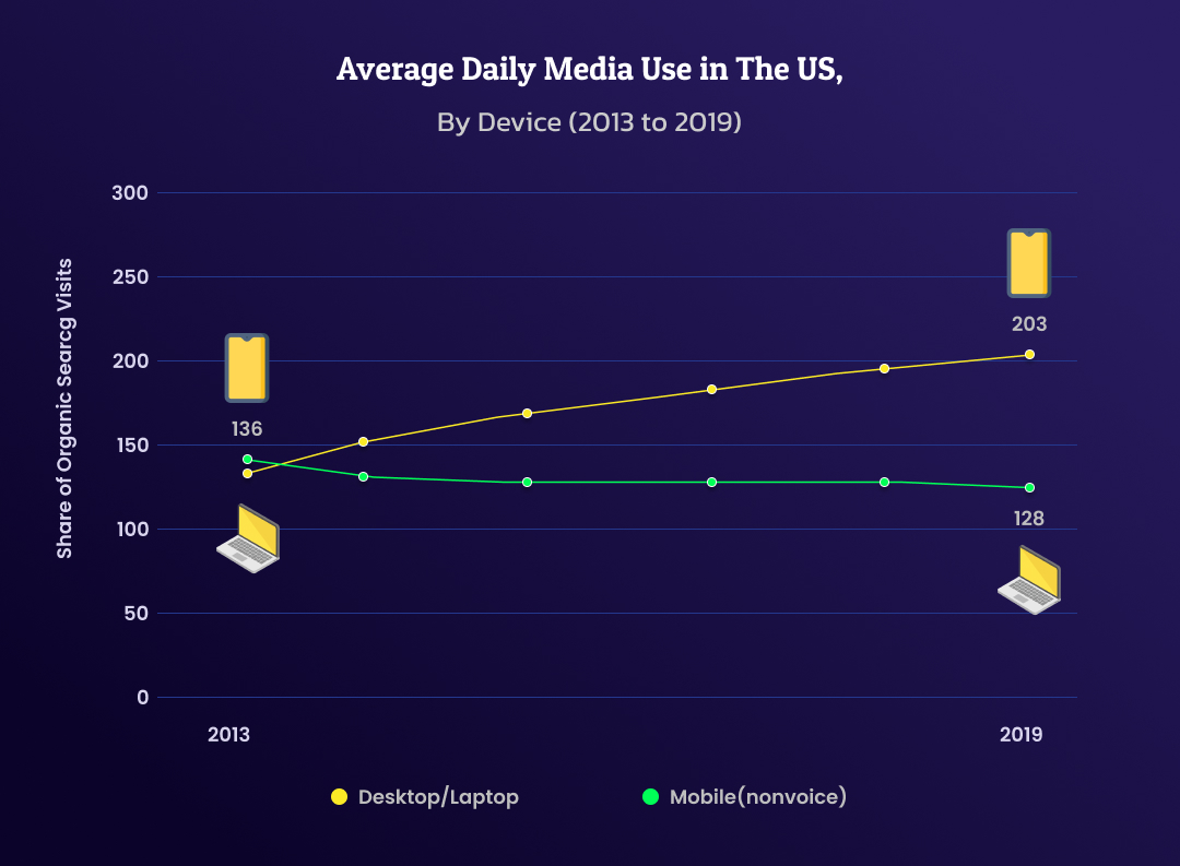
From the data provided by Broadband Search (2019), mobile devices growth is showing an upward trend. However, from the perspective of the design, there are many challenges between Mob App and Desktop designs. Let us see below the major difference between the two parties.
| Title | Mob App Design | Desktop Design |
| Screen size | Space optimization is necessary as there is less room for various forms of digital content. The designer needs to analyze which content needs prioritization and eliminate irrelevant stuff. | There are no space constraints, and the designer can incorporate a diverse range of digital content into their design space rather than prioritizing priority ones or deferring them to the next pages. |
| Dropdown Menu | Screen space restrictions curtail quick navigation, and many apps use side menus with expansion and contraction features. Vertical aligned, large buttons are created to accommodate many options. | Multiple categories and subcategories are freely displayed. It is feasible to incorporate and flexible enough to navigate freely and quickly. They perform appropriately in a user-friendly environment. |
| Gestures | Users get the pleasure of using gestures while interacting with the touchscreen. It takes the form of swiping, moving left or right to move images, and tapping multiple times. This gesture support assists people who are hesitant to click on a link with their cursor. | Here, the only way to interact with the screen is by clicking on a link or browsing with a cursor. |
| Forms | Filling out a form on a mobile device is a very difficult task. The forms viewed should be vertically oriented for the best user experience. While desktop websites have two fields for the first name and last name, mobile devices only have a single field. | It is straightforward and hassle free. |
| Content Display | The mobile phone also uses scroll bars to view large content. They can easily switch between vertical and horizontal models. Therefore, the designers need to think about design in both variations. | Desktop apps give users the freedom to view the content both vertically and horizontally, irrespective of its size. Scroll bars are used to scroll content up and down. |
| Location | Mobile gadgets are portable and require only internet connectivity. Mobile phones make it simple to access websites. While designing for a mobile site consideration needs to be given to internet fluctuation, communication time, and user location change. | Desktop apps are static and therefore, their performance is linear. |
What is the process of mobile app design?
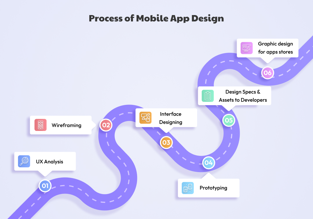
UI/UX design is a critical job, and they need to ensure the design created matches the project scope without further additions or deductions to the functionalities. Once the design is approved and sent to development, any discrepancies trace back to the design. This causes an unnecessary time delay and extra cost.
Let us see the steps involved in creating the final design of the product.
1. UX analysis
The first requirement for the designer is knowing the reason behind creating the apps. For that, a clear understanding of the client’s business is required. The design process will take shape only after analyzing the feasibility to develop solutions.
Second, the designer needs to be aware of the presence of apps in the market with similar concepts. If they are available, find out their strengths, weaknesses and performance from user reviews and case studies.
Finally, know who the end users of the app are? What features will benefit them? Their input is needed to make decisions. This can be done through surveys, polls, and questionnaires.
2. Wireframing:
Wireframes are created once the designer understands the business.
The reason for creating them are
- It gives a basic outline of how the client’s idea is formulated.
- It highlights the gray area and helps designers resolve them.
- It supplements the scope of work, and since it is cost-effective and less time-consuming it is comforting for both the designer and client to take forward in the right direction.
Marvelapp and Adobe XD are the most common platforms used for wireframing.
3. Interface designing:
This place is exclusively reserved for designers to display their aesthetic sense in terms of color, font, images, and much more. The final product design takes shape from here and is mandatory to create a good impression of the app.
Designers work mainly on these principles. Simplicity – where unnecessary things are kept at bay. Visibility – for having an eye-soothing effect on the user while clicking on various interfaces.
The designer should try to incorporate the latest technology for various features. These model options, like AR and voice technologies, help to promote the app’s image without draining the user’s wallet.
4. Prototyping:
Creating a prototype helps the designer view it on a mobile device and gain experience like a real app. Marvel’s app and Disney XD are some of the prominent tools for prototyping.
This prototype is added to the website through an embed code provided in the marvel app interface. The designer can retrieve the prototype anytime to understand the flow or change it. It is a suitable way of testing the designs.
5. Design specs & Assets to developers
Completed and approved designs are entrusted to the developers for integration into their software. The specs and assets are transferred to the developers. The usual way is slicing from the design software and creating a document with all the relevant information ranging from typefaces and color palettes. This does not guarantee accuracy.
However, tools like Zeplin give the convenience to upload the approved design directly from design software.
6. Graphic design for apps stores
The designer is required to provide graphics in accordance with Google Play and App Store. There are three types of assets in preparation namely; app logo, app screenshots and promo video.
Best Practices to Improve Your Mobile App User Experience
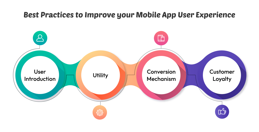
All mobile apps ‘go through the grind’ in the process of mobile app design. But, only some mobile apps are successful, and many face a premature end. What is the reason for this contrast? The one common factor found in all unsuccessful mobile apps is poor user experience.
When mobile platforms evolve to meet the changing needs of the time, the user experience should never be compromised. It always needs to retain the top spot on the agenda. Mobile UX encompasses inputs from the client, designer and developer based on their experiences.
Let us discuss the generic practices to augment user experiences on mobile applications
User introduction:
Onboarding Ease:
The method adopted to onboard a user is the litmus test for the success of the product. Any complication in this first step will end up with many users abandoning the app.
- Provide them with basic instructions and let them not spend too much time there.
- Additional information to be introduced in phases for building curiosity and maintaining a positive retention rate.
- Give a basic demo of the value and features of your app instead of disclosing more information at the initial stage.
Convenient log-in:
Mobility duration has increased in humans, so allow users the convenience of logging in through external accounts such as Google or Facebook.
- Avoid unnecessary details from users, such as phone numbers.
- Allow them to use simple usernames for them to remember.
- Give them the option to remain logged in to use the app frequently, instead of logging back in each time.
Utility:
Navigation simplicity and Menu accessibility
Limited screen pages need to be well utilized, and refrain from using the same design technique of a website for developing mobile apps. Facilitate easy navigation and place the menu prominently.
Standards icons
Use standard icon vectors that are familiar to the users. It is common knowledge that a specific icon denotes only that purpose. Apps need to follow platform-specific standards for icons common to both iOS and Android. Use design patterns to enable an easy learning curve.Brief and compact
Screen presence varies between mobile and web applications. Mobile content should only contain necessary information. Too much information makes it very difficult for users to digest. Let the mobile design be interactive rather than a cluster of information.
Conversions Mechanism:
Search convenience:
The search option is the main artery connecting the entire application. Therefore, give users the convenience of removing filters to give them full freedom of searching. Never reduce the search result to zero, instead display similar items, thereby giving them the option to explore along the same lines.
Rapid checkout
Allow users the ease of filling out form details through autofill and a reduction in the number of fields during the check-out process. Offering “a guest checkout option gives them the convenience to purchase the product without opening a new account. This sets a path for purchasing and enhances conversion rates.
Security:
Security needs to be the top priority of any mobile application. Security badges guarantee safe passage while preserving the confidentiality of personal information. Without a safety net, no user will be ready to disclose their credit or debit card details on a public platform.
Customer Loyalty:
Interact with the users
Retaining customers is an ongoing process, and the only way to connect with them is through reviews, ratings, and comments. Having genuine feedback will help you understand their pain points and improve the product through intermittent upgrades. Addressing their issues is the right approach for user retention.
Closing thoughts:
With the best practices needed to follow for building a perfect mobile UX app design. Let us conclude about us, at iSQUARE we practice what we preach, and our application building follows a user-centric approach. As per the clients’ guidelines, our design and development team implements the strategies and follows the best practices
“Design is not just what it looks like and feels like. “Design is how it works.” – Steve Jobs.
Just as quoted by Steve Jobs, Mobile UX design plays a crucial role in determining the interaction, response, and engagement of the user with your mobile app. If you prefer your mobile app to stand out in the market, pay close attention to the user experience.
Join forces with us to develop a robust user-friendly mobile model. Contact us at the earliest and allow us to serve you immediately.


